The Incredibles.
I love the use of straight and curved lines in their concept art, especially the collage and collage-style pieces.
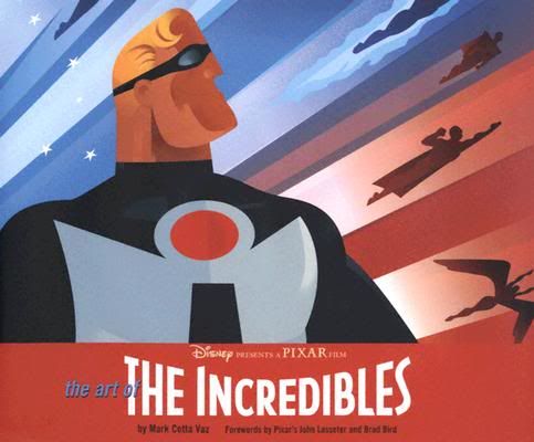
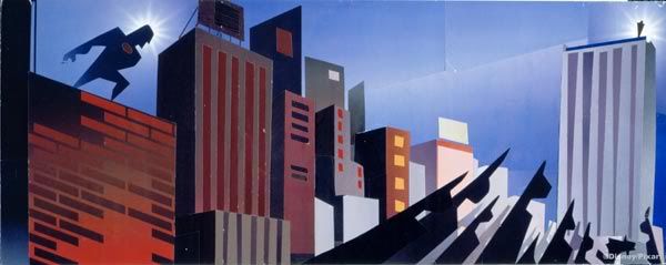
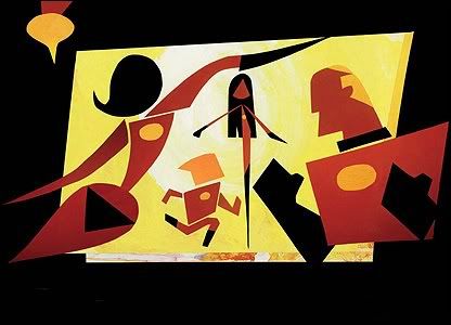
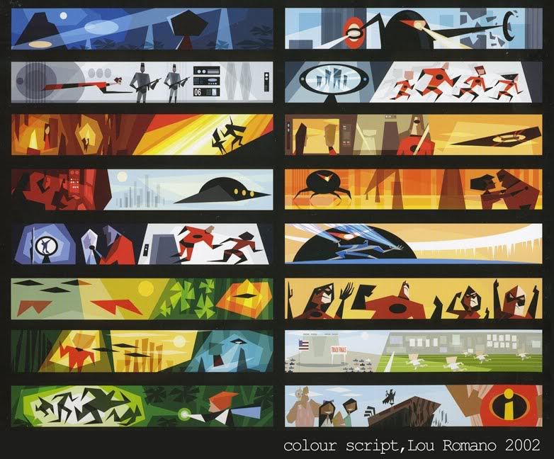
I love the colour use as well. Everything really shouts fifties but they've made it so original that it stands alone. I really like the idea of capturing something similar in our work, especially the simplicity of their style.
Below is my attempt to use shapes from objects from the late fifties to create stylised characters:
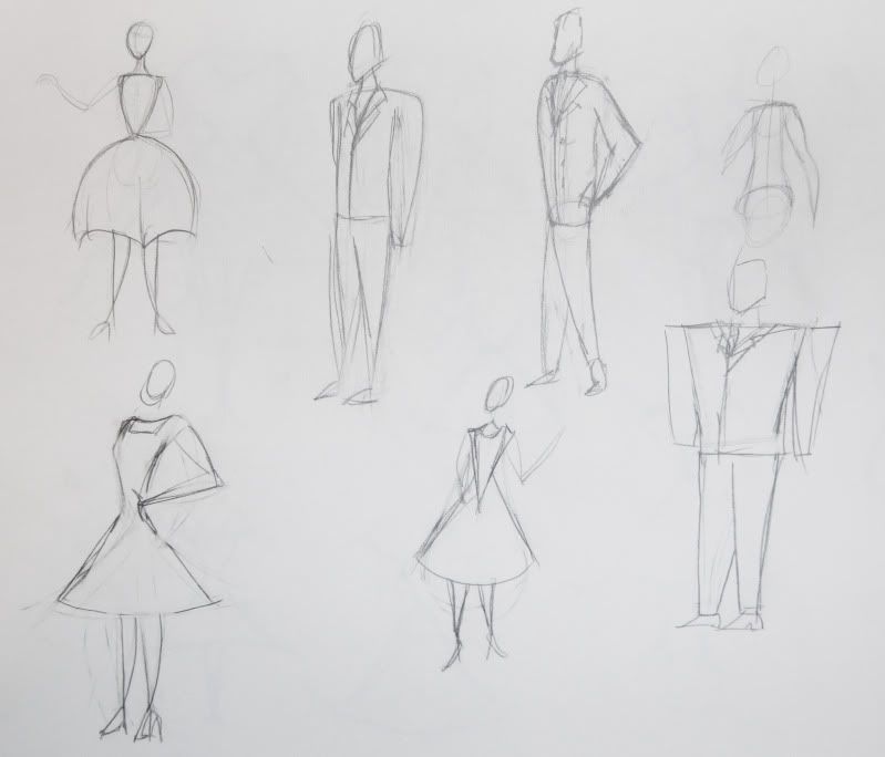
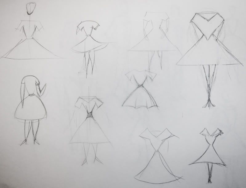
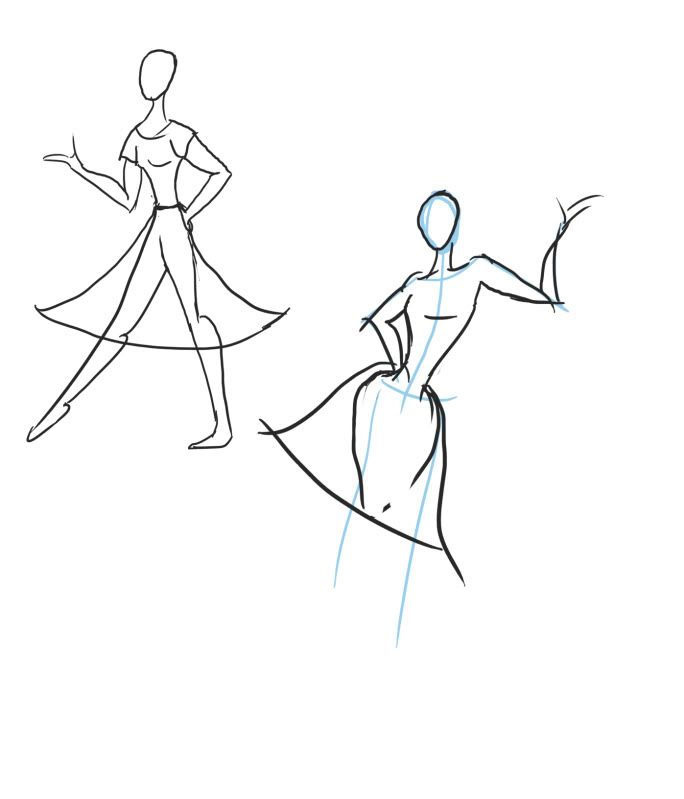
Some are okay but I think they're not quite right yet. After this I then decided to look into fifties illustration:
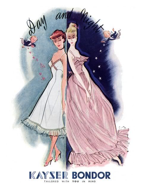
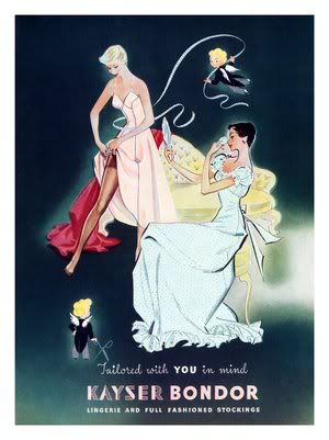
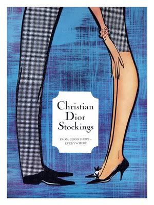
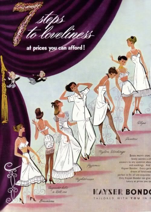
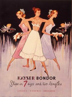
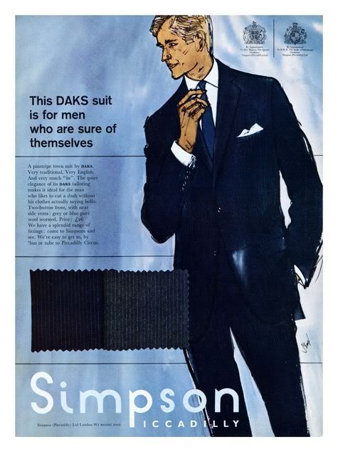
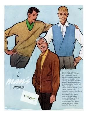
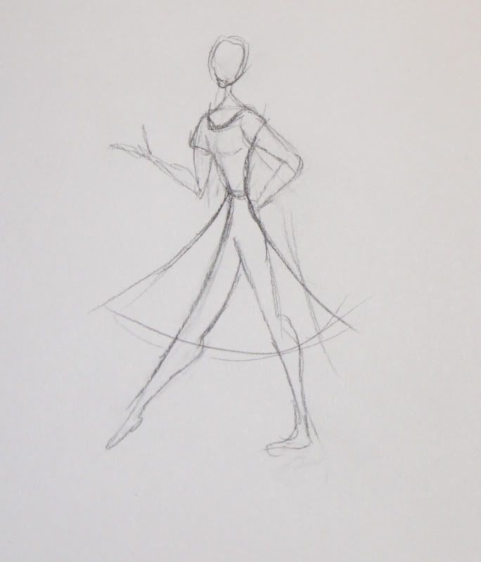
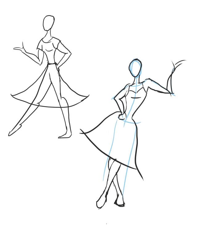
It's obviously very rough and not that explanatory but I think the shapes are there. I want to know though if this is the right way to go though or if I'm running off on a tangent at the moment. Feel free to say what you think works and what doesn't, we'll talk further about it tomorrow I'm sure.
No comments:
Post a Comment