Below are some of my favourites that we could use as part of our style:
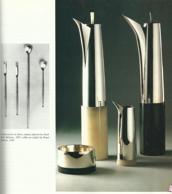
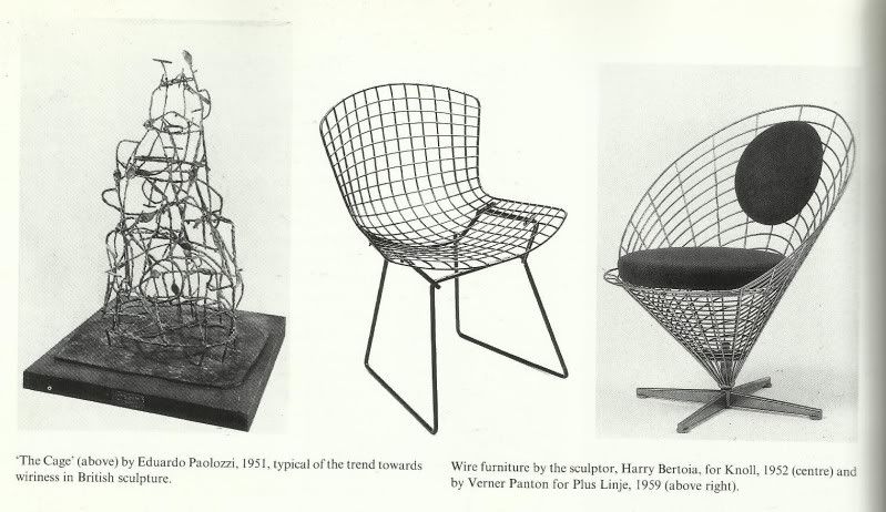
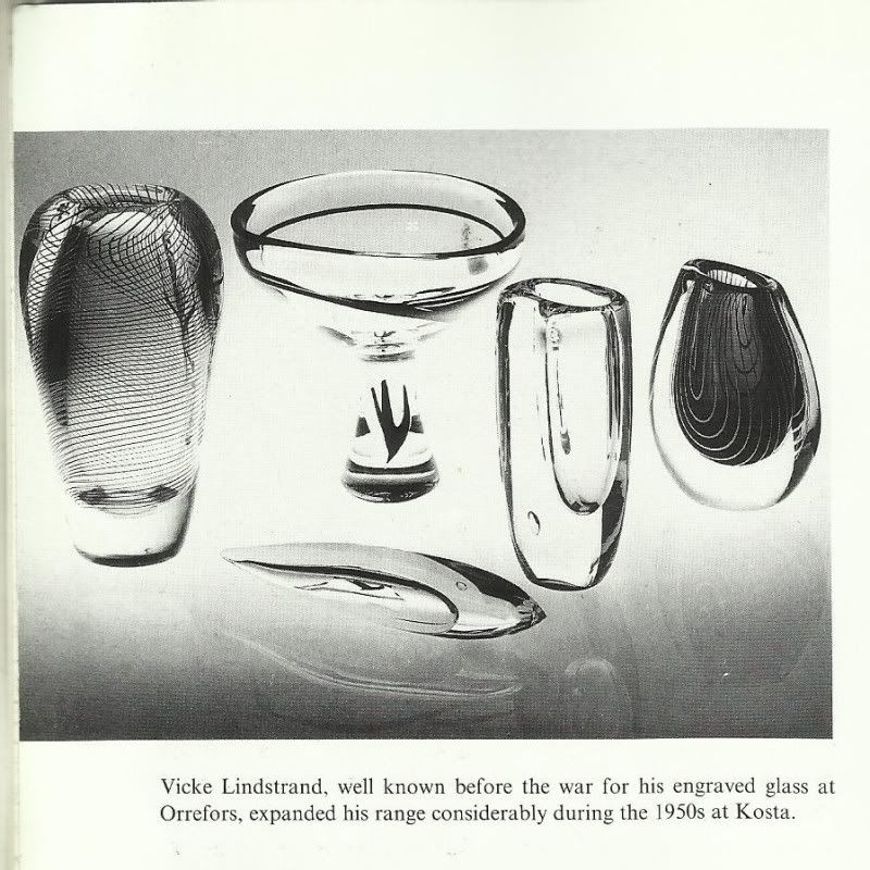
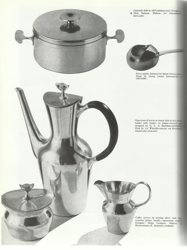
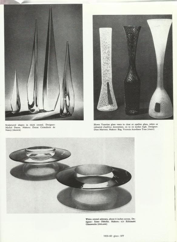
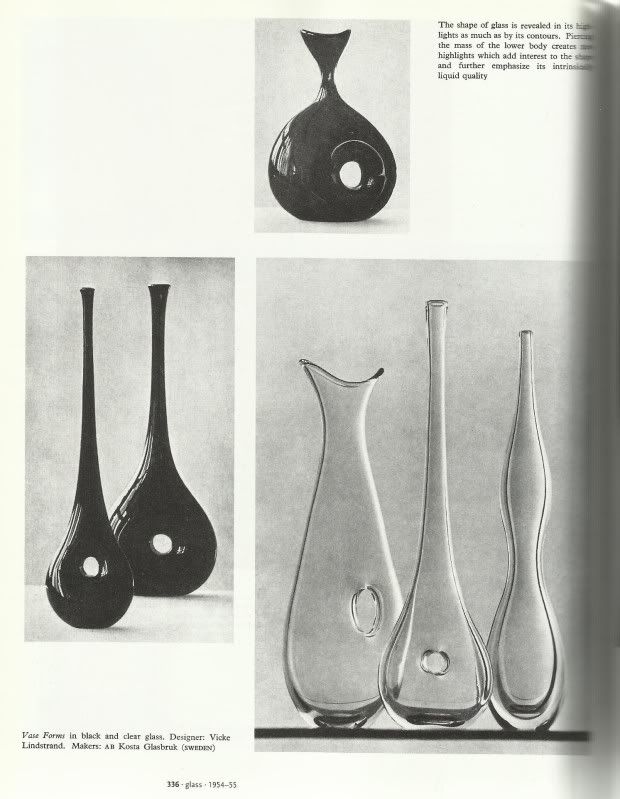
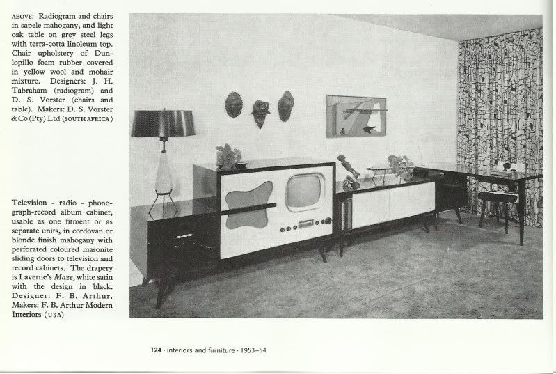
Sorry they're mostly in black and white, those were the pictures in the books. Great stuff though, I'm really looking forward to experimenting with the shapes and lines they used for our characters and environments :D
Bibliography:
Opie, Robert (2006) The 1950s Scrapbook. UK: pi global publishing limited.
Fiell, Peter, Fiell, Charlotte (2000) 50s Decorative Art. Taschen
Jackson, Leslie (1991) The New Look: Design in the Fifties. Manchester: Manchester City Art Galleries
Fiell, Peter, Fiell, Charlotte (2000) 50s Decorative Art. Taschen
Jackson, Leslie (1991) The New Look: Design in the Fifties. Manchester: Manchester City Art Galleries
Hi
ReplyDeleteIt would be great to see a storyboard at this stage. Something rough will do so that the discussion about shots can begin.
No matter whether it is black & white or colored. The pictures are clear but the text part of the picture is illigible.
ReplyDeleteLiked all the pictures in Black and white.
ReplyDelete