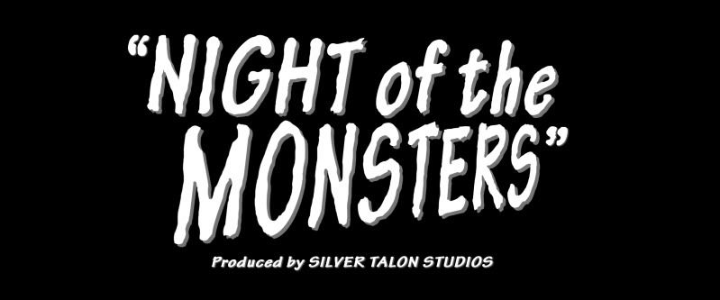
I had a chat earlier today with Phil and it was really clear that our group needs to have a direction as at the moment we aren't really going anywhere. When we finished talking he'd given us a lot of help on the subject of the art direction, story and film elements so I thought I should make a post comprising of everything we decided on and you can tell me what you think.
- Our film is essentially a product of the 1950's and not a very high end product at that. As a production company from then we don't have a large budget, it's the same as the amount Ed Wood would've had when making his films. Just think back to the sets on the sound stage he used and how rubbish they looked, that's what we're going for.
- On that note, we have to remember that the creatures we're designing have to be people in suits. This does mean that the monster designs we have so far will need to be simplified right down to the basics and not very shiny basics at that.
- These costumes should also refer back to previous films such as The Fly (1958), where they were really just men with a fake head and hands. If we have a long costume then we can have the actor's legs poke out every so often. This is the kind of fun and low budget look we need, I think.
- I know we've already talked about this but it needs to be realised now as we need to have art direction/production design. I've decided that I'll take control of this and use your designs to be simplified down to super low budget costumes. Your designs are great guys, they're just too sophisticated to use as they are. Because of that I'm going to use them and make them look rubbish but still keeping the original look of the creatures. If that makes sense?
- Visually our film should be black and white, in keeping with the traditional genre films of the time. This doesn't mean that we can't work on the details or colouring of everything, in fact it means we need to be more careful so nothing is washed out.
- We'll also use dramatic lighting because as Phil mentioned, that's pretty much all the low budget films had.
- Just because the trailer is supposed to be a relic of a low budget B-Movie doesn't mean it's going to look rubbish. We will have to deliberately make sure that everything fits the world it comes from, everything has to look artificial and staged. We might even have times when you can see the boom/camera or even the edge of the stage in shot.
- I'm making an influence map at the moment of all the influences Phil mentioned so I can show you both exactly what I'm going for.
- A new animatic will be made by me, very basic but it will address the issues in our story.
- One is that we've got three great creatures and no where in the trailer do we show them off. I know we wanted to use silhouettes but it seems a waste to have spent so much time on the designs and not use them. Luckily, when they're simplified down they'll actually be made of the same body duplicated and added to so there's less to worry about.
- The creatures need more of an origin in the trailer too. We'll need to see something to indicate that they started as humans and we transformed into creatures. Phil suggested seeing their hospital beds with charts at the end of them and the transformations could be cross-fades of a couple of blend shapes. The trailer will feel quite different when it's put together in this animatic but I think you'll appreciate it and hopefully agree that it's a better set up for our creatures.
There's probably more to mention but if you're both in tomorrow then hopefully I'll remember and you can let me know what you think. Sorry if this is all a bit drastic but we're 7 weeks in and we're still on creature designs so I thought I needed to speak to Phil to get us back on the right track. We can all 3 of us speak discuss any problems with Phil if necessary but I'm sure he'll recommend the same things.
Reference is on it's way and I promise you it'll work out great! :)

No comments:
Post a Comment