Here is the rough storyboard. The writing can be changed, I just thought up one so there is something in there.
Wednesday, 19 October 2011
A Couple of Style Ideas...
I've already spoken to Katy and Sean a little about this previously but I thought I should make a post about what I've looked into so far:


I love the colour use as well. Everything really shouts fifties but they've made it so original that it stands alone. I really like the idea of capturing something similar in our work, especially the simplicity of their style.
Below is my attempt to use shapes from objects from the late fifties to create stylised characters:


Some are okay but I think they're not quite right yet. After this I then decided to look into fifties illustration:


I felt like I turned a corner when I found these. I love the shapes in them, particularly the Kayser Bondor and Christian Dior adverts. This was a big inspiration for me and I drew this quickly:


The Incredibles.
I love the use of straight and curved lines in their concept art, especially the collage and collage-style pieces.
I love the colour use as well. Everything really shouts fifties but they've made it so original that it stands alone. I really like the idea of capturing something similar in our work, especially the simplicity of their style.
Below is my attempt to use shapes from objects from the late fifties to create stylised characters:
Some are okay but I think they're not quite right yet. After this I then decided to look into fifties illustration:
It's obviously very rough and not that explanatory but I think the shapes are there. I want to know though if this is the right way to go though or if I'm running off on a tangent at the moment. Feel free to say what you think works and what doesn't, we'll talk further about it tomorrow I'm sure.
Tuesday, 18 October 2011
New Storyboard Ideas...
Katy and I had a meeting and this is what we decided:
- Open with text warning about the horror of the film you're about to watch. 10 seconds
- Scene of scientist working with three labelled beakers of the animals DNA/blood and then cuts to a close up of him putting it in a syringe. 10 seconds
- Text/voiceover warning that it all goes horribly wrong. 5 seconds
- Scene of destroyed lab with a few things still rolling around; the shadows of the monsters rush across the scene. 5 seconds
- Sirens start playing and we now see the perimeter fence pulled open by the monsters.
- Camera raises and revelas the lit-up town in the distance. 10 seconds
- Cut to sequences of attacks:
- Dead sheep in the field (maybe a monster shadow). 5 seconds
- Robber is attacked down an alley (shadows against the wall) 10 seconds
- Trailer rocking with shadows inside and screams/monster noises. 8 seconds
- Monster swipes at the person's silhouette. 5 seconds
- Monsters eyes beam out from under a house or similar. 5 seconds
- Hero cocking his gun, ready to take them on.
- Text pops up saying something like: "Could you face the horror that lurks in the dark?"
Saturday, 15 October 2011
Rough notes for The Storyboard
Here are some ideas for the storyboard. Feel free to change them or add to it.
- Starts of introducing how scary the film is with some writing
- 3 containers are shown containing the animals DNA
- Shows scientist working in the lab
- A shadow is seen of one of the monsters in a messed up lab
- Outside the perimeter fence has been ripped through
- The town is seen
- Showing some dead sheep
- One of the creatures hand is seen ready to slash at someone
- Eyes are seen in the woods in the dark
Monday, 10 October 2011
1950's Research...
Okay there's a lot here so I'll add the slideshow and I'll put up the particular shapes that I liked:
Below are some of my favourites that we could use as part of our style:


Below are some of my favourites that we could use as part of our style:
Sorry they're mostly in black and white, those were the pictures in the books. Great stuff though, I'm really looking forward to experimenting with the shapes and lines they used for our characters and environments :D
Bibliography:
Opie, Robert (2006) The 1950s Scrapbook. UK: pi global publishing limited.
Fiell, Peter, Fiell, Charlotte (2000) 50s Decorative Art. Taschen
Jackson, Leslie (1991) The New Look: Design in the Fifties. Manchester: Manchester City Art Galleries
Fiell, Peter, Fiell, Charlotte (2000) 50s Decorative Art. Taschen
Jackson, Leslie (1991) The New Look: Design in the Fifties. Manchester: Manchester City Art Galleries
Sunday, 9 October 2011
Thought id make a post with pictures of things relating to some of our characters and themes.
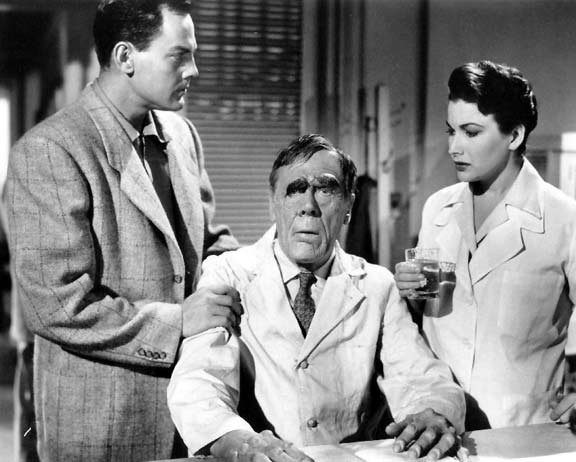
| the scientist of the 50s |
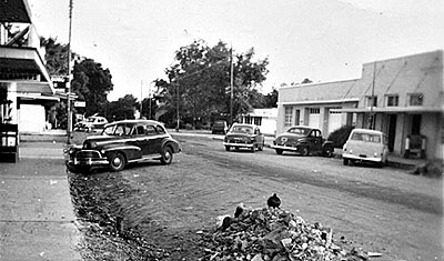
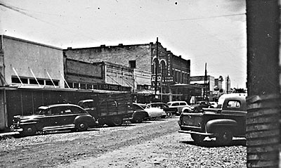
| 1950s Texas |
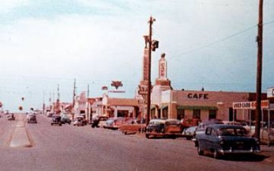
| 1950 Texas postcard, colour print |
| farmer |
![]() |
| womens fashion |
![]() |
| how the average 50s woman would look |
| a screenshot from the 1955 film "tarantula" |
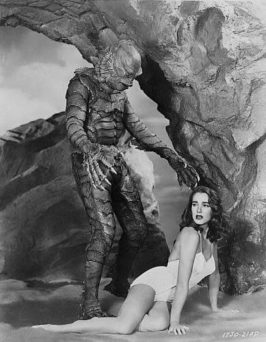
| black lagoon creature, from Larry Doyle’s upcoming novel “Go Mutants!?" |
Useful Links
http://hereshesat.blogspot.com/2011/02/nifty-fifty.html - a list of 50 things to do with the 50s (fashion, film, adverts, music, designs etc).
http://www.spaciousplanet.com/world/photo/14380/1950s-science-fiction.html - a list of some cover art, titled "The 65 Best Sci Fi Paperback Covers Of All Time"
http://www.replayphotos.com/popularsciencephotostore/covers-1950s-pictures/_1950s___0001048.cfm - more cover art
Styles of the 50s
Here are some styles from the 50s era. Everything seems bulky and slightly exaggerated, example the tail fins on the car. Lots of shades of browns too.
Radio
Wall Clock
Television
Tail fins from a Cadillac
Fridges
Subscribe to:
Posts (Atom)